
Kick Integration Layout Guide
StreamWeasels Kick Integration comes with many different layouts. These layouts have their own settings on top of the main plugin settings. You can find out more about each of the StreamWeasels Kick layouts below:
Kick Wall (FREE / ESSENTIALS)
Section titled “Kick Wall (FREE / ESSENTIALS)”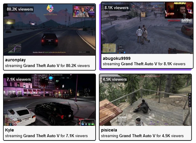
Kick Wall - Classic Kick layout for displaying many videos at once.
Kick Wall Shortcode Attributes
Section titled “Kick Wall Shortcode Attributes”Each layout has it’s own settings page, which includes a few settings which are unique to that particular layout. You can customise the settings on the settings page or you can customise the settings directly on your shortcodes, with the attributes below:
For example:
[sw-kick layout="wall" wall-column-count="4"]| Field | Attribute | Values | Description |
|---|---|---|---|
| Column Count | wall-column-count="" | Number | Set number of columns to divide up streams in wall. |
| Column Spacing | wall-column-spacing="" | Number | Set pixel spacing between columns. |
Kick Status (FREE / ESSENTIALS)
Section titled “Kick Status (FREE / ESSENTIALS)”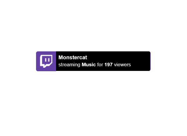
Kick Status - Simply display Kick live status on every page on your website.
Kick Status Shortcode Attributes
Section titled “Kick Status Shortcode Attributes”Each layout has it’s own settings page, which includes a few settings which are unique to that particular layout. You can customise the settings on the settings page or you can customise the settings directly on your shortcodes, with the attributes below:
For example:
[sw-kick layout="status" status-placement="static"]| Field | Attribute | Values | Description |
|---|---|---|---|
| Show on Every Page | none | 1 | Global setting to enable Twitch Status on every page. |
| Hide Offline | status-hide-offline | 1 | Hide Twitch Status when all users are offline. |
| 0 | Show Twitch Status when all users are offline. | ||
| Placement | status-placement | Absolute | Display Twitch Status fixed to the window in the corner. |
| Static | Display Twitch Status exactly where you placed it on the page. | ||
| Vertical Placement | Top | Display Twitch Status at the top. | |
| Bottom | Display Twitch Status at the bottom. | ||
| Horizontal Placement | Left | Display Twitch Status at the left. | |
| Right | Display Twitch Status at the right. | ||
| Vertical Distance | status-vertical-distance | Number | Choose the distance (in pixels) from the edge. |
| Horizontal Distance | status-horizontal-distance | Number | Choose the distance (in pixels) from the edge. |
| Custom Logo | status-custom-logo | Image URL | Upload a custom logo to replace the Twitch logo. |
| Logo Background Colour | status-logo-background-colour | Colour Hex Code | Change the background colour of the logo. |
| Accent Colour | status-accent-colour | Colour Hex Code | Change the accent colour of Twitch Status. |
| Controls Background Colour | status-carousel-background-colour | Colour Hex Code | Change the background colour of the left / right arrows. |
| Controls Arrow Colour | status-carousel-arrow-colour | Colour Hex Code | Change the colour of the left / right arrows. |
| Disable Carousel | status-disable-carousel | 1 | Enable the carousel when multiple channels are displayed. |
| 0 | Disable the carousel when multiple channels are displayed. | ||
| Enable Classic | status-enable-classic | 1 | Enable classic mode to simply display an online / offline message. |
| 0 | Disable classic mode. | ||
| Classic Online Text | status-classic-online-text | Text Input | When classic mode is active, choose custom online text. |
| Classic Offline Text | status-cllassic-offline-text | Text Input | When classic mode is active, choose custom offline text. |
Kick Feature (PRO)
Section titled “Kick Feature (PRO)”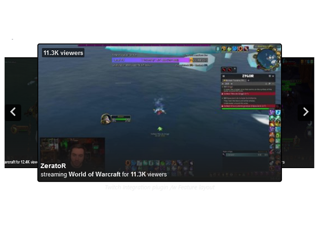
Kick Feature - Slick, professional-style layout inspired by the Kick homepage.
Kick Feature Shortcode Attributes
Section titled “Kick Feature Shortcode Attributes”Each layout has it’s own settings page, which includes a few settings which are unique to that particular layout. You can customise the settings on the settings page or you can customise the settings directly on your shortcodes, with the attributes below:
For example:
[sw-kick layout="feature" feature-embed-position="inside"]| Field | Attribute | Values | Description |
|---|---|---|---|
| Embed Position | feature-embed-position="" | Above | Embed stream content above the feature carousel. |
| Below | Embed stream content below the feature carousel. | ||
| Inside | Embed stream content inside the feature carousel. | ||
| Controls Background Colour | feature-controls-bg-colour="" | Colour Hex Code | Background colour of the controls arrow. |
| Controls Arrow Colour | feature-controls-arrow-colour="" | Colour Hex Code | Colour of controls arrow. |